Textbox
Use
this widget to give the user the opportunity to enter free text no longer than
a line, such as street address, e-mail, etc.
After you drag
the Textbox widget in your form, click the Edit button in the upper-right corner of the widget.
The Textbox window appears, displaying the following tabs:
Labels
and text
On this tab, perform the
following:
· In Label input field enter the
label of the textbox.
For example,
Address or Email
· If desired, you can add Placeholder text
which is text that will be displayed in the field before the user adds
anything. Once someone clicks into it to enter text, this will be removed.
· If needed, in Instructional text,
enter instructions or explanatory text for the textbox.
The text is displayed bellow the textbox.
· If required, in Predefined value, enter a predefined
value for the textbox that is displayed in the box by default. The user can
change it.
This is
different from Placeholder text because it will be submitted with the form if the user does not change it. Placeholder text will not be submitted.
· If you want to make the textbox mandatory, select the Required field checkbox.
A textbox appears where can you enter the error message that is displayed if
the user does not fill out the textbox.
Limitations
These options
will prevent users from entering a type of data different from what you’re
asking for. In other words, they’ll only be able to enter the type of response
you define here.
For example,
if you select “email” here, people will have to enter a valid email address and
no other kinds of input is allowed. If the @ symbol is missing, there will be
an error message.
· Using the Type dropdown
menu, define what kind of input you’d like to allow.
· In Range input fields, enter the
minimum and maximum number of characters that a user can enter in the textbox.
If you do not want to set a limit to the textbox, leave the Max input
field empty and the Min input field 0
A minimum
input of 0 will allow the field to be left blank.
·
Enter an error message that is displayed if the user enters less
than or more than the defined limits.
When you are
finished, click Save
Page break
The page break widget can
turn a form into a multipage form.
Page breaks work as
separators and divide the form to different pages. They enable users to
navigate between the pages of the form.
At the end of each page,
the page break automatically includes a Next button and a Submit button on the last page.
You can also enable
the Previous step option, so that users can navigate between form pages. By default, this
option is not enabled.
When you
place the page break on the form body, the form automatically displays two new
layout placeholders – header and footer. When you remove the last page break
element, the header and footer placeholders are removed from the form as well.
In the editor of the Page break widget,
you can modify the following:
· Next step button
You can edit the name of the button that enables users to go to the next form
page.
· Allow users to step backward
This option enables users to go to the previous page of the form. By default,
this option is disabled.
· Previous step button
You can edit the name of the button that enables users to go to the previous
form page.
If you did not enable the Allow users to
step backward option, this button is hidden.
When finished,
click Save.
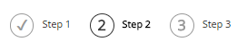
The Form navigation widget is optional, but
helpful in multipage forms. It will display which step the user is currently
on, and the previous steps that have been completed.
It is best to place this at the top or bottom
of the form page.
In the editor, you can change what the labels
say. By default, they are Step 1, Step
2, etc. The
number of pages you have will be reflected in the editor automatically.
When you are
finished, click Save
Multiple choice
Use
this widget to ask the user a question, allow them to select only one of
several predefined answers.
Multiple choice is a radio
button group, and the label of the group is the question that you want to ask.
After you drag the Multiple choice widget into your form, click the Edit button in the upper-right corner of the widget.
The Multiple
choice window appears,
displaying the following options:
· In the Label (Question) input
field, enter the label of the radio button group.
The label of a multiple choice group should be a question, with the possible
options given as predefined radio buttons.
Users will
only be able to select one option.
· In the Choices input fields, enter the
possible answers to the question you have defined.
By default, there are three input fields.
In each input
field, enter an answer, or choice.
If you need
more or less choices, you can add and remove input fields by clicking Click to add a choice
under the
existing choices.
You must have at least two choices.
· If you select Add
"Other" as
a last choice checkbox, the system adds another
undefined choice to the multiple choices.
When the user
selects that last choice, an input field is displayed, where the user can enter
another answer different from the predefined multiple choices.
· If you want to make this section mandatory, check the Required field checkbox.
A textbox appears where you can enter the error message that is displayed if
the user does not fill out the textbox.
When you are
finished, click Save
Checkboxes
Use this widget to ask the user a question and give the user the
opportunity to select one or more of the predefined answers.
After you drag the Checkboxes widget into your form, click the Edit button in the upper-right corner of the widget.
The Checkboxes window appears,
displaying the following options:
· In the Label (Question) input field, enter the label
of the checkbox group.
Users will only be able to select multiple options.
· In the Choices input fields, enter the
possible answers to the question you have defined.
By default, there are three input fields.
In each input field, enter an
answer, or choice.
If you need more or less
choices, you can add and remove input fields by clicking “Click to add a choice”
under the existing choices.
You must have at least two choices.
· If you select Add "Other" as a last choice checkbox, the system
adds another undefined choice to the multiple choices.
When the user selects that last
choice, an input field is displayed, where the user can enter another answer
different from the predefined choices.
· If you want to make this section mandatory, check the Required field checkbox.
A textbox appears where you can enter the error message that is displayed if
the user does not fill out the textbox.
When you are
finished, click Save.
Paragraph text box
Use this widget to give the user the opportunity to enter free
text longer than one line, such as customer feedback.
After you drag the Checkboxes widget into your form, click the Edit button in the upper-right corner of the widget.
The Textbox window appears, displaying the following tabs:
Labels
and text
On this tab, perform the
following:
· In Label input field enter the
label of the textbox.
For example,
Address or Email
· If desired, you can add Placeholder text
which is text that will be displayed in the field before the user adds
anything. Once someone clicks into it to enter text, this will be removed.
· If needed, in Instructional text,
enter instructions or explanatory text for the textbox.
The text is displayed bellow the textbox.
· If required, in Predefined value, enter a predefined value for the textbox that is
displayed in the box by default. The user can change it.
This is different from Placeholder text because it will be submitted with the form if the
user does not change it. Placeholder text will not be submitted.
· If you want to make the Paragraph textbox mandatory, select
the Required field checkbox.
A textbox appears where can you enter the error message that is displayed if
the user does not fill out the textbox.
Limitations
The Paragraph
text box only has a character limit.
· In Range input fields, enter the
minimum and maximum number of characters that a user can enter in the textbox.
If you do not want to set a limit to the textbox, leave the Max input
field empty and the Min input field 0
A minimum
input of 0 will allow the field to be left blank.
·
Enter an error message that is displayed if the user enters less
than or more than the defined limits.
When you are
finished, click Save.
Dropdown list
Use this widget to ask the user a question and select only one
of many predefined answers.
After you drag the Dropdown list widget into your form, click the Edit button in the upper-right corner of the widget.
· In the Label (Question) input field, enter the label of the dropdown
box.
· Under Choices, enter the possible
answers to the question you have defined.
By default, there are three input fields.
In each input field, enter an answer (choice).
· To add a choice,
click, Click
to add a choice under the choices list.
This will bring up an empty choice in the
list. Click “Enter label” to give it a name.
Now click “Enter label” to give it a name.
The field
will be highlighted in yellow and allow editing.
· To delete a choice, click the “x” in the left side of the choice
label.
· If you want to make the dropdown menu mandatory, select
the Required field checkbox.
A textbox appears where can you enter the error message that is displayed if
the user does not fill out the textbox.
 Note: If there have already forms
created that capture an address, the list of US states, Canadian provinces
and/or list of all countries, etc. will be pre-existing. Should you need a different long list of
dropdown menu choices that would not be feasible to enter manually, contact
support and we can create the dropdown menu choices for you.
Note: If there have already forms
created that capture an address, the list of US states, Canadian provinces
and/or list of all countries, etc. will be pre-existing. Should you need a different long list of
dropdown menu choices that would not be feasible to enter manually, contact
support and we can create the dropdown menu choices for you.
When you are
finished, click Save.
Use this widget to display a simple heading for a section.
Under Format, you can
choose different heading sizes.
When
finished, click Save.
Content block
This will give you a Content block you can use
for almost anything. Use this widget to enter content directly using the text
editor and
its features. You can use the basic formatting options of the
text editor. You can type and format text, insert images, documents, and
symbols.
For more
information on the Content block widget, see the Widgets section.
File upload
Use this widget to give the user the possibility to upload one
or more file attachments to the form.
After you drag
the File upload widget in your form, click the Edit button in the upper-right corner of the widget.
The File upload window appears, displaying the following tabs:
Label and text
On this tab, perform the following:
· Under the Label field, enter the label of the upload box.
For example, “Upload an Ad”
· In Instructional
text, enter instructions or
explanatory text for the textbox if needed.
The text is displayed bellow the label and above the “Choose File” button.
· If you need to make the upload
mandatory, select the Make required checkbox.
Limitations
On this tab,
perform the following:
· If you want the user to be able to attach more than one file,
select the Allow multiple file uploads checkbox.
· Under Range, in the
In Min and Max fields, enter
the range of the file size in MB you’ll accept as attachments.
· You can change the error message to display when the file size
is out of range.
· Under Allowed file types, select one of the following:
· All file types
· Selected file types…
A checkbox group appears where you can limit the types of files
that you accept as attachments.
You can also enter the file extension manually, by selecting Other…
You can edit the error message
that will appear if the attached file does not meet the specified criteria.
When
finished, click Save.
CAPTCHA

Fun fact:
CAPTCHA is an acronym for “Completely Automated Public Turing test to
tell Computers and Humans Apart.”
Use this
widget to protect your website from spam and abuse.
You do not
need to edit any settings for the CAPTCHA after dropping it into the form.
Use this widget to display the button that the user uses to submit the
form.
You must have a Submit button widget in
your form. The widget is automatically added by the system when you drop the
first widget in the form, but if it’s accidentally deleted you can add a new
one.
You can also edit the button to make it say something other than
“Submit.”
· Click the Edit button in the
upper-right corner of the widget. The Submit button window appears.
· In Label input field, enter the label of
the button.
By default the button is labeled Submit
· If you have a multipage form, you can give the user a link to go
back to the previous step by ticking the checkbox under the label. You can also
change the text of the Previous Step
link.
· When you are finished, click Save
 Note: If there have already forms
created that capture an address, the list of US states, Canadian provinces
and/or list of all countries, etc. will be pre-existing. Should you need a different long list of
dropdown menu choices that would not be feasible to enter manually, contact
support and we can create the dropdown menu choices for you.
Note: If there have already forms
created that capture an address, the list of US states, Canadian provinces
and/or list of all countries, etc. will be pre-existing. Should you need a different long list of
dropdown menu choices that would not be feasible to enter manually, contact
support and we can create the dropdown menu choices for you.